deep dive into Material UI TextField built by mui
The Material Design system is a design system used to create consistent digital experiences across platforms such as android, web and ios. Includes:
- a color system
- a typography system
- a shape system
- a grid system
- it addresses motion
- and lots more
Also includes Material Theming which makes it easy to customize Material Design to match your brand.
Material Design is not just a set of guidelines it is a whole ecosystem.
Material itself stopped maintaining it's react implementation and recommends opensource versions.
A very popular open source implementation is MUI, a react component library built to implement Material Design. Bills itself as the "worlds most popular React UI framework" and at this time has 1.2M weekly downloads on npm and used by over 750k projects on github (did I mention it's very popular?).
Note: there are other react component libraries implementing bootstrap and ant design for example, so up to you and your design team on what you choose.
Using a component library or not is an important choice. Building your own can provide a lot of flexibility but is a big big big undertaking. There is so much to consider including: ui states, responsiveness, platforms, build & deploy systems and organization, tests and testing, accessibility etc. People move on and interests change. Over time such an undertaking will probably not get the support it needs. Therefore in most cases (especially startups) eng, design and product should just choose a design system which closest matches your design goals and use its component library. Using pre-built (and tested) components can save a ton of time and free your engineers up to work on product features and more complex ui interactions which need to be built.
However, there is benefit to looking at what it takes to build these components. You can learn a ton from studying library code and see how they solve problems using css and html.
I did a deep dive into MUI Text field and the MUI TextField code. How did they structure the html? the styles? how did they build the cool effect of animating the placeholder text out when focus into the input?
react component html structure:
<InputLabel>
<FilledInput>
<InputBase>
<FilledInputInput>
<OutlineInput>
<Input>
<FormHelperText>
</TextFieldRoot>
- InputLabel and FormHelperText are conditionally rendered if label or helper text is passed
- One of 3 input components Input/FilledInput/OutlineInput is created based on the "variant" property passed.
- FilledInput passes the component to render FilledInputInput and FilledInput styles to InputBase component as well as other info such as html input type and multiline
- components={{ Root: FilledInputRoot, Input: FilledInputInput
- Input and OutlineInput do the same thing: pass their details to InputBase to render the input as they need.
- InputBase has all the handler and effects code
- This is a composition approach, not inheritance.
- This is far more complicated that it seems here
Makes use of forwardRef to expose a ref to the component.
note: TextField could display a Select instead of Input if select property is passed but am not going to dig into that,
styling:
- very interesting to me is the "floating label" i.e. when the input is empty we see a placeholder text but when input has focus or content the placeholder text floats above the input. How is that achieved?
- well to start, it's not using placeholder text! it actually uses an html label which is absolutely positioned inside the text input (interesting!). So it looks like placeholder text
- once the input gets focus, a hidden legend (inside a fieldset) is made visible around the input and
- the label is moved to sit right on top of where the legend text would appear!
- and the actual legend text is hidden
- I believe using label this way is for accessibility purposes because clicking the label will focus onto the input
- you can pass states such as error as a property to the TextField component and that will render the error state for the control
- uses styled components, styles in the react code in object
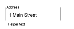
- label/legend
- the actual input
- helper text

Comments
Post a Comment